

There’s a subtle, underlying trail that we follow as we experience transitions in marketing. Think going from a postcard to a website, or a banner ad to a landing page, for example.
Colors, shapes, fonts, copy. These all create what I like to call a “digital scent” that can affect everything from user experience to lead conversion and even search engine rankings.
We’ve been trained to create these transitions using sales copy and big, bold calls to action, yet we sometimes see abysmally low conversion rates once someone makes the transition we want them to make. This often is caused by a lack of a strong digital scent.
It’s a symptom of not attending to the details that can make or break the effectiveness of your overall campaign.
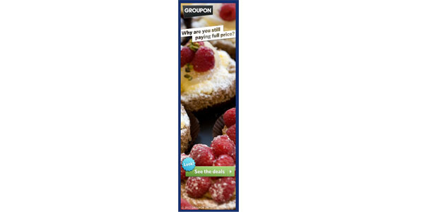
Let’s walk through an example from Groupon that I recently came across:

I see a banner ad with delicious pastries asking me “why are you still paying full price?” I wonder… what exactly are they referring to? Pastries? I am kind of hungry so I click the call to action to “See the deals” expecting to see something related to deals for pastries or food of some sort.
Instead, I land on a page for The Ashley Inn of Tillamook:

Huh? That’s weird. There are no pastries. The color palette is different. The shape of the call-to-action button is different. Basically, everything about this transition is broken. I don’t know why I’m here. I’m off the scent. I click back on my browser.
The transition from a call to action to a landing page should be seamless. As the reader, I shouldn’t be puzzled about where I am or wondering whether something went wrong to get me there. That’s true whether the action I took was scanning a QR code, clicking a button, or typing in a domain name. No matter the path, I expect a consistent look and feel from one point to the next.
Consistency – through offers, imagery, colors, shapes, font and copy – will ease the transition and provide more of a soft landing, which will lead me down the intended conversion path more effectively.
Now, an example from another big brand, Netflix:

I recently cancelled my cable, but like watching movies every once in a while. This banner ad and the offer of a free trial where I can instantly watch TV shows and movies definitely grabs my attention. I click through to this:

I’m greeted with familiar colors, shapes, images and low and behold, the very offer I was expecting to see. The scent is strong. I click the call to action and proceed to register for my free trial.
How can this apply to real estate marketing?
Brokers and even individual agents can benefit from creating a strong digital scent in all their marketing and advertising touch points.
Here’s a good example from an agent using an email marketing platform called Nudge:

Bright colors, vivid images, a nice clean layout and a strong call to action. This is good marketing.
Now, if I click through to Carol’s website, I find the colors and look and feel are all very similar to what she designed on her marketing piece shown above.

They’re familiar to me. I’m comfortable. If I was in the market for a home in San Diego, I’d be lured by the digital scent and led pretty easily down the conversion path.
Hopefully, these examples make it clear how these consistencies can create a strong digital scent and why that’s valuable to your marketing. Start to look at these little details and ask yourself whether your marketing is putting out a strong enough scent into the world. Be deliberate and consistent and you’ll likely see better results.
The post Digital Scent: How does your marketing smell? appeared first on WFG’s Tech Talk.
The post Digital Scent: How does your marketing smell? appeared first on WFG National Title Insurance Company.


